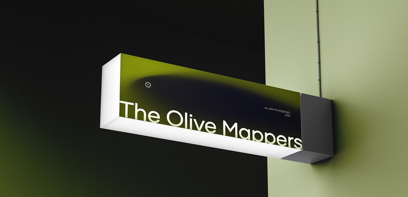
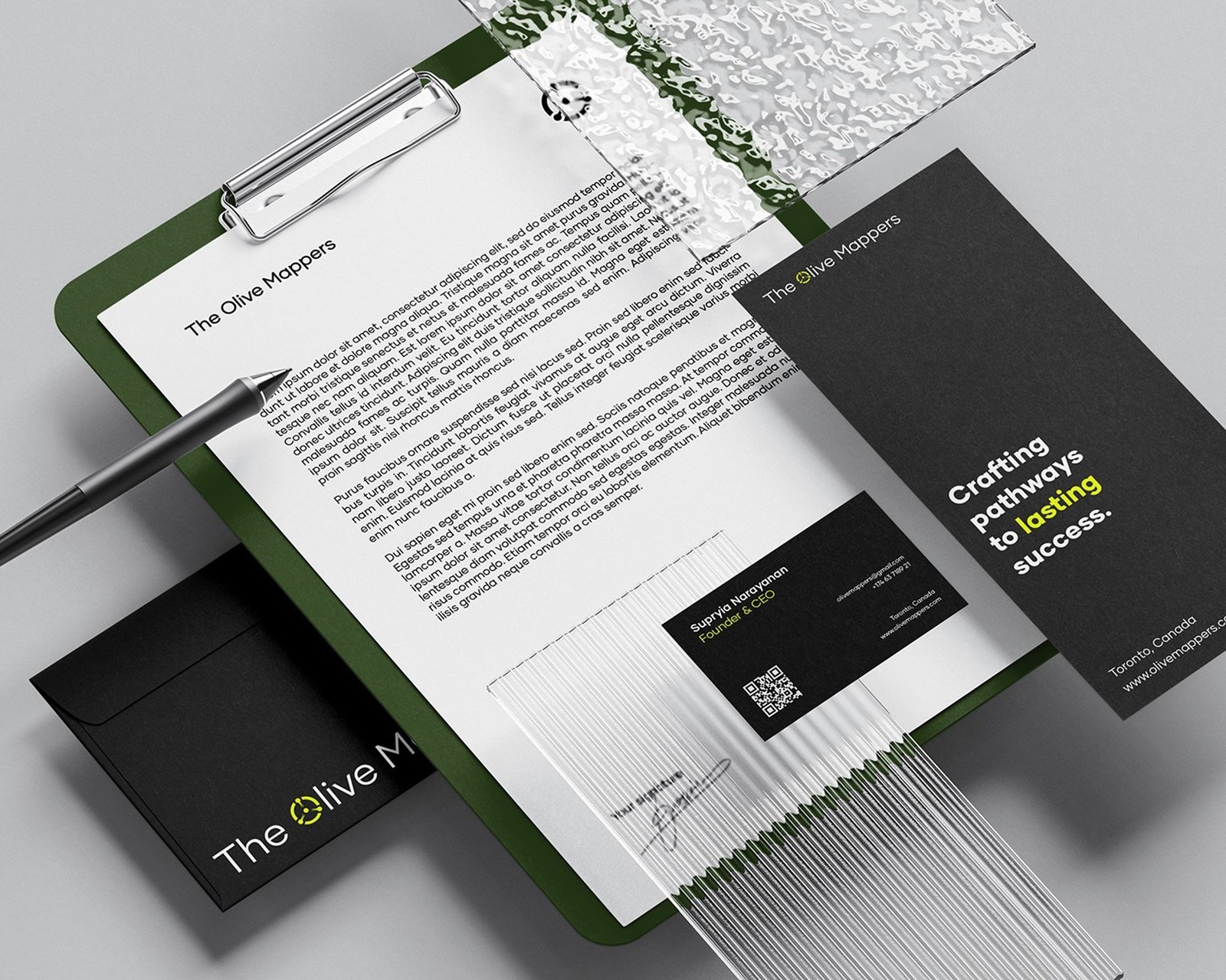
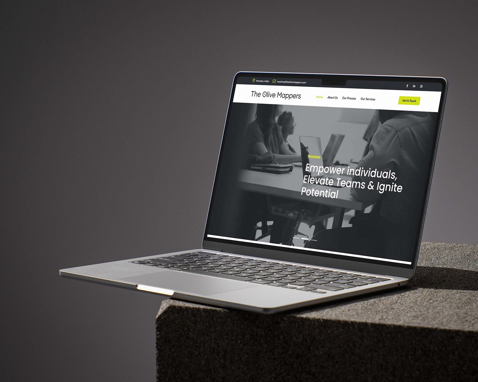
The Olive Mappers brings recruitment, training and consulting together to help people and organisations navigate growth with greater direction. The brand needed to communicate expertise and structure while still feeling approachable and optimistic.
The task was to unite three connected service areas within one clear identity, build credibility with organisations and professionals, avoid conventional corporate-HR clichés and express the brand’s role as a practical guide.
The thinking
We built the strategy around guidance, transformation and informed progress. The brand needed to feel like a map, not a maze — helping people and organisations understand where they are, where they can go and how to move forward.
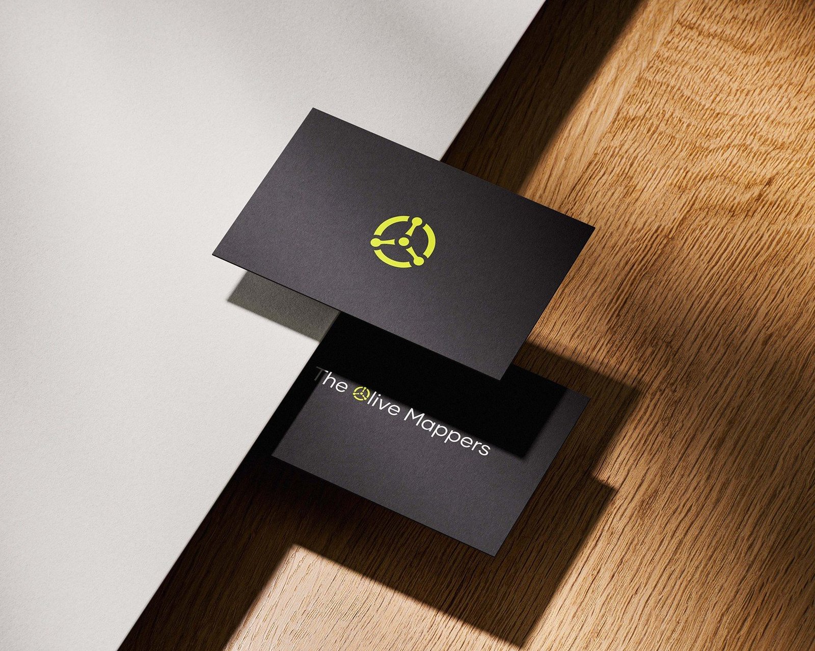
A circular symbol with three directional pointers represents the brand’s three pillars and the idea of a compass or framework. The Sage and Magician archetypes balance expertise and possibility, while the modern professional palette supports a knowledgeable, encouraging and action-oriented voice.
Below is a small snippet of the project. To check out the full case study, please visit our Behance page.